Animation
Moom Poses/Dramatic poses-https://georgia-betteridge.blogspot.com/search/label/Action%20Poses
Weight Lifting-https://georgia-betteridge.blogspot.com/search?q=Weight+lifting
Charlie Chaplain-https://georgia-betteridge.blogspot.com/search/label/Charlie%20Chaplain
Infrographic/Title Credits-https://georgia-betteridge.blogspot.com/search?q=Opening+credits
https://georgia-betteridge.blogspot.com/search/label/Infographic
Facial animation-https://georgia-betteridge.blogspot.com/search/label/Facial%20animation
Acting classes(no upload or link required.)
Drawing
Life Drawing T2/ Drawing T1-https://georgia-betteridge.blogspot.com/search/label/Life%20Drawing
Analogue Sculpting-https://georgia-betteridge.blogspot.com/search/label/Sculpting
Character Design-https://georgia-betteridge.blogspot.com/search/label/Character%20Design
Maya and Associated Software
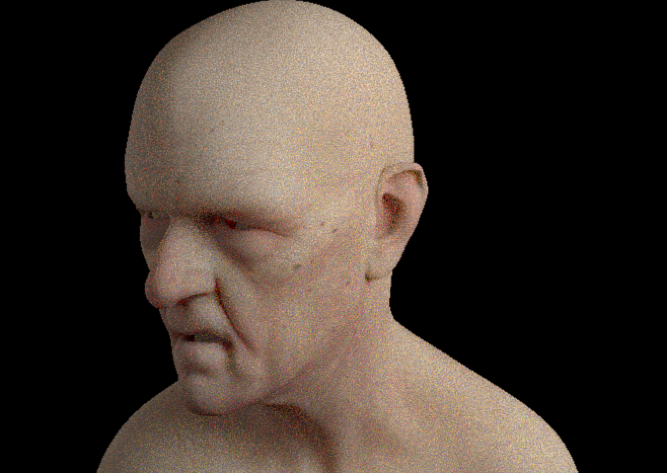
Head Modelling-https://georgia-betteridge.blogspot.com/search?q=Head+ModellingBody Modelling
UV Layout
Skinning
Body Rigging
Facial Rigging p1
Facial Rigging p2
Facial Rigging p3
Texturing
Turnarounds
Lighting and Rendering 2/Arnold Part 2-https://georgia-betteridge.blogspot.com/search/label/Lighting%20and%20Rendering
T2 Intro to Mudbox-https://georgia-betteridge.blogspot.com/search?q=Mudbox
Thursday, 16 May 2019
Displacement


These are the final renders, the toadstool doesn't have the texture as in the displacement folder in source images there was no jpg to put as the colour I'm afraid.
Dino:

Have to turn the levels down to 0 before importing the obj to Maya.
by doing pgdown which is fn and the up and down keys on Mac.

This happens when you have extracted the displacement map and so you need to turn the paint layer off.

catclark iterations to smooth. You already know what the final iteration is as it is the highest level the model was in Mudbox.

Set up in render view and added the sub shaders which you can add the file and name them in the hyper shade and look at all the nodes and it's easier to switch between.
The specular needs more roughness and less weight on the head.
Displacement maps are the older maps and are simpler but when you have an object like the toadstool which the geometry disappears you need to use a vector displacement map. so moving on to the...
Toadstool:


Same process pretty much except Maya automatically puts the displacement as not a vector one so in the nodes Hypershade menu you have to delete the SS and the file and then click the checker box for the Vector one and do it that way then rest is the same with the iterations e.t.c.
Both have to be extracted as maps at 4000 x size and have to be set as object and an Open RGBA. 32 bit. When objects are taken from Mudbox into Maya they are ten times the size hence the heigh having to be changed to 10 to get everything.
Wednesday, 15 May 2019


Friday, 10 May 2019
Gone over more orphogrpahic's

The Quarter View
(I have been saving the ai and jpeg etc of each one and putting them all in folders.)

Front View

Back View

Top View

Side View
Older Georgia:
Back View

- Next I need to go over all the drawings of the older Georgia. Front side top quarter.
- Then I need to do a list of all the prop's and orthograph them too.
- Also need to think about how I'm going to do the animatic better in the meantime.
- And revisit tk2. and see if I can get further with that before deadline.
List of what I need over the summer
Things I am going to need to make "For Infinity"
- Finish the rest of the character orthography post them and put them in a folder top side etc. organised ready for September.
- Animatic so it makes sense to other people, takes up full screen clearer and more frames added. (so the movement's are clearer and camera moves.)
- Draw the orthographs of the other props I am going to need and orthograph them.
Wednesday, 8 May 2019
going over orthography again result


I think it's starting to look more like the drawing now and this is a ton more accurate than before and I noticed how important the nose and eyes were to stay cute in terms of the size and everything.
Tuesday, 7 May 2019

Friday, 3 May 2019
What I have been up to so far


Ok so I have took the drawing into Ps and been manually going over the lines as accurate as possible then I have been colouring/shading everything...one thing I noticed was that I didn't lose the way the drawing originally looked doing it this way..however this may be a starting point for how I could refine lines without straight away restricting myself to the path way of outlines? but I should likely go over these later with the path? other than that I have been trying to enhance the drawing's and I'm going to do the rest of the background this dark blue then I was going to add some more colour tones for example a darker and lighter blues and using the brush type that adds a sort of feeling of an outer part of a planet the blur looking one to it and also add a kind of grey metal kind of floor they are on like a part of a station or robotic terrain. I was also going to do the title in a metal grey also. Once I have gone over it all and have a look at adding rockets or ships or stars..I don't want to overcrowd it.
This colour of blue was used because its one of the first colours that come to mind that is space that isn't black and it would be possible to still see everything also it brings back nostalgia for what I think of my character's having as a background colour. Oh and the font may need to be a different size or moved down more etc.
The bottom picture is to show the process a bit clearer..
I was thinking once I have done this picture I need to go back to my orthography and first very carefully draw one rthe lines manually then go over them with a path etc to get it still looking the same as the drawing's and not lose charm maybe?? I would like to just re-start the orthographic's process from the beginning and scrap my first attempt from before.
Thursday, 2 May 2019
todays work and what I need to do next.

Today I did this drawing and I spoke to Alan he said it looks it shows the project coming together with both of the character's and said how it looks like a poster so I should use this drawing to help me get better at line drawing on photoshop and illustrator and then put the painted shades in etc and how I need thin and thick lines and match the drawing as much as possible and not lose the charm and think about where the line would start in terms of the thickness is it in the middle, edge etc? after this I would be more ready to then go onto the orthographs. Also he said about doing a font and recreating this picture with the 3d model's later down the line.

I have been trying to create a font that has both the title and the style of my characters with the curved lines and straight lines I also looked at some examples of fonts in the genre and of both buzz and 40k and noticed the strong capital words the slant...then Alan said about how I need to show the fonts meaning/purpose through the font more so how I could get this idea of infinity so the lines are going off of the page..I also need to think about what I can have in the background and the composition in the meantime for example if I have rockets or planets in the background/logo where should I put them and what will get eyeline following etc not too chaotic etc.. this was what I started to come up with. The planet may be too generic but it was just an idea for now that kinda makes sense for both worlds but it could change.


I also did a few drawings to look at the specs I put in the animatic and drew the cake toppers.
Subscribe to:
Comments (Atom)


