Spy Red Character Bible1 by on Scribd
Showing posts with label Character Design. Show all posts
Showing posts with label Character Design. Show all posts
Monday, 14 January 2019

Thursday, 6 December 2018
Graphic Design and Layout lesson

Everyone got given a theme and mine was ww2. So for the first page I thought it could be an introduction so there is infantry, tanks and planes as one whole simple shape this is done by overlapping and silhouette. The second page has a sergeant rank badge and a gun leaning on it to emphasise ground soldiers and is an abstraction so not showing the entire image. However this could spread onto two pages so that there is an equal amount of space on these two pages as the planes and tank page etc...

Again on the page for planes there is an abstraction so it is highly reliant on peoples knowledge of the war but this icon of the spitfire is enough to indicate it is focusing on planes. And lastly tanks which is a complex mechanism so its easier to pick the main part of a tank in this case the tank track so you know that is the focus without showing to much and being still a background entity.
Now I need to apply what I have learnt to my Character profile bible.
- Simplicity
- Shapes
- Colour
- Alignment
- Tones Values (opacity distance.)
- One entity not two that get your attention off track.
- Focal Point
- Proximity-clutter but done well e.g. more than one shape being put together by overlapping etc and making it one overall shape.
- Sweeping lines=people follow these.
- Common fate, people all same size walking,looking same direction repetition.
- Closure=not showing everything using negative space.
- Remember the difference witht the foreground and the background.
- figure out the grand voice.
- Eye line.
- Don't make it too dramatic.
- don't make it to static and make you look off the page.
Tuesday, 27 November 2018
The Three main Frames: Unleashing the Gadget

I edited the original so it was bolder and could see it better. went over drawings on photoshop.
The first diagonal frame is a dramatic shot hence the diagonal. The second shot is more of a stand off and close call and for the last shot I tried to go for a more spy stance and she has won and got her power back. She will be bold red how she has been shown before with some black details.
I might have the shadows more bold. etc. I want a lot of space around the characters and eyeline to get people to look where I'd like. But overall this is the kind of scene I'm dealing with.
Tuesday, 20 November 2018
Scene Storyboarding

I looked at the Untouchables for A Roof Chase Scene and based it on my Spy character and antagonist and started to establish how I am going to add drama to the scene with the angles and what events could take place.
There has been some main frames I am going to focus on which I will upload.
Important staged scenes of weakness and strength changing dynamic.

this storyboard is not for the spy. This was given it is also not good in terms of build up and there's more shots I could have use also the flashback is not needed it could have been seen before.
Tuesday, 6 November 2018
Character Design

Character Design of the two emotion's grief and wonder. Then i got the object of a tap.

Happy build up to sad build up we looked at the lines and facial muscles that make the expression with my spy character so far.

A Modern tap that thinks he is better than the old tap so the modern one is taller, straighter, snaring almost lots of water. Old tap has the knobs turn inwards like a frown/brow and as if it has a spine is sad looking through its curvature and less water. Been Replaced. Also the tap part is seen as the noses without it literally having eyes etc...
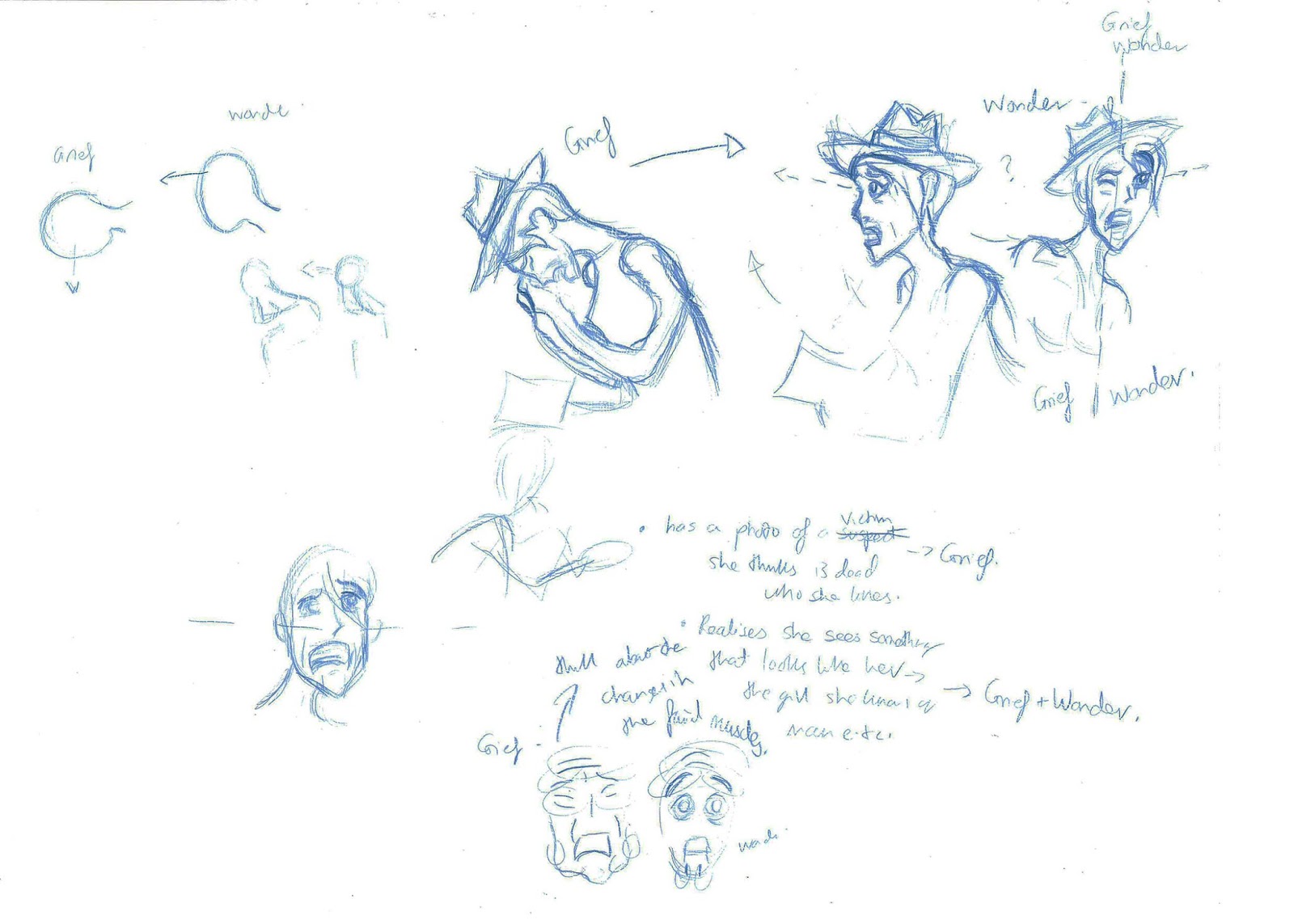
Where i started of in terms of the muscles and how i could show the expressions in different ways top half/bottom half or a mix of both throughout.
Tuesday, 23 October 2018
Character Design Spy

Today I looked at colour,Style a narrative taking place on a roof a masculine macho character that isa bit dense big gun. Powerful Protagonist women using the gadget of a 1960 polaroid instant image camera and provides a transition to completing her job and about tot get awnsers.
Polaroid freezes the character entirely in a state of paralysis. Silhouettes Bright colours, Saul bass 1960 Chicago Spy poses Trench coat etc. Glamourous and powerful. Next I need to carry this on through a more developed storyboard characters and turn arounds of both of my two characters and develop my male character henchmen.
I need to do more wireframes like underneath to get a better understanding of both my characters etc...I also looked at others gadgets like pistol glove, the hidden recorders, and the heel transmitter and the lipstick gun.
But I need to look at the wireframes for these characters etc like we did in the lesson activity today.
Tuesday, 16 October 2018
Character Design Lesson Environment


Today I tried to draw an idea for my spy's environment, but i know what needs to be done to go forward with this idea now..
I'm going to do a short storyboard where the setting is on a roof this is so the city isn't to to cluttered and more simplistic and can focus on the spy scenario of unleashing the gadget e. G chasing down a villain. The style needs to be match my character Design and needs to match the surroundings e. G shapes and bold. Shadows Saul bass, spirals and Andy warhol, a bright 60s colour for my spy to stand out and show the personality e. G red.


Tuesday, 9 October 2018
Secret Agent Drawings and Character Design

This was the more final style I started to get today.

This is like Saul Bass to get an idea for shapes etc.
Today I learnt about how to get a character looking independent and like they're going to kick ass but also still feminine etc.. so to do this the pose was important for the shapes and these as reference were good for Sass,Attitude,Action:


The Character is way wrong in terms of 1960 style what I need but this is what. had and added top half shows paranormal version of spy, lots of Chicago 1960s things but not refined or simple. I will likely bring this into something like the top image later on.

Top part started adding colours. Bottom part started extracting Paranormal shapes like the rectangles and then organic parts the big ears. The Skeleton,Zombie inspired faces the Frankenstein look.

Since Paranormal includes a lot of school stereotypes I decided id have a teacher who looked like a werewolf or a vampire headmaster. You can also see a 1930's rubber style characters as were not sure if we are going to look into that with our Virtual Duck Studios group.

So the idea was he would have big rectangular ears also but they point more like a wolf, hairy, rectangular glasses smaller eyes as he is older, big body etc...

Monday, 8 October 2018
Secret Agent Drawings inspired form Research


becomes a secret agent in 1960's Chicago.

Female anatomy.

Independent, was a factory worker while men at war.
Tuesday, 2 October 2018
Character Design Ancient Japan

Justin gave us a time period and got us to look at furniture, weapons,shapes and think about the characters associated with these items.
I ended up with an evil ancient Japanese looking storage hiding very easily reachable weapons and a protagonist looking one like a shrine. and peaceful.

I noticed that these items are very artistic, decorative,elegant,Curves,swft,straight lines.
I noticed a lot of symmetry.

I looked at the art they have but thats almost an illustration in itself already.
Wednesday, 26 September 2018
Wednesday, 31 January 2018
Character Design Lesson

Today we learnt about habitats and what the animals/monsters need to be a predator, scavenger or prey and the kind of shapes etc..

Wednesday, 24 January 2018
Character Design Lesson


We had to pick a iconic character and have a new design or object the coud use by taking shapes and knowledge of the character for these designs of jetpack I looked at the Space Ranger symbol on his arm and saw the rocket and also the scene in toysjory with it made me think it could be pretty cool like faster also the wings are based on his insignia on his chest which is similar to the space ranger one but has wings on each side so I decided to put these together and add the buttons and the part which replicates his middle half. I also though it could match woody well as its quite heroic or like a bird and that eagle type icon could match n that sense as a companion also since buzz is seen diving then his wings come out I thought this action could be emphasised more with the wing movement below.

Today we looked at characters that were merged with an object and how the type of people obsessed with that thing could be replicated. I picked a rock metal guitar and a rocker billy which would have quite a calm layer back gesture. Whilst the rock one is erratic the necks can give more of a linguistic and performance so I will be doing some drawings of these with a marker pen with the swerves as I can be quite stiff with how I draw so I will be taking this advice from Justin.
( I will updating character lesson posts if I am doing more development. )

The Guitars ( flexible rocking out on stage)
Thursday, 18 January 2018
Character Design lesson


In my lesson with Justin Wyatt I got given knights, I chose the idea of making the knight physically impaired to the rest the reason for this is to have a unstereotypicaj protagonist and a motivational character because he struggles. e.g sword to big for him and pathetic sized helmet the glasses and the attire show his vulnerability and recognisable of a nerd at school. (role-play.) and the normal life to fictional aspect.

The second character is juxtaposed the protagonist because this makes a more interesting character because Justin said about silhouettes and if they communicate the characters attributes well. so this is a more stereotypical knight but his face is non threatening without the helmet. and looks like jock. maybe without the amor he is fat or just face seems misplaced for comedy value.

Silhouettes of possible middle character.. girl could be taller and the protagonist. I am going to develop some of these designs for future. :] We also learnt how different shapes add different meanings or characteristics.

Swinging sword: loses control needs to be adjusted so its less stiff and more exaggerative of patheticness.

Storyboard box of how the character sees the bigger knight ( Scary ) dominance over box etc.
Saturday, 7 October 2017
Illustrator: Alien Design


In Digital Class with Simon we learnt how to use the pen tool on illustrator and how to do gradient shading and multiples for shadow, work with the layers and fill colour and make Outlines different widths the idea of making a character based on stereotypes I chose the nerd/geek stereotype and used a person to base this on. We also learnt how to make multiple versions of the character and how to lay it out for quick styles or colour schemes.
Subscribe to:
Posts (Atom)

-
Ok, so what I've tried to do is try and mix the landing with the rigged buzz here. Landing is kind of hard I'm finding(Shot2b): ...
-
 So I've done neck detail and some of the circles on the leg and knee part I did the armour detail on the gauntlet an...
-
Any advice on what I have? Need to add more into the reel, but keep it short, I need a part with the 2d facial rig of this character.. and I...

