Process of Calder Inspired City by Georgia Nicole Betteridge on Scribd
Showing posts with label What If Metropolis. Show all posts
Showing posts with label What If Metropolis. Show all posts
Sunday, 8 July 2018

Tuesday, 3 July 2018

Saturday, 30 June 2018


Friday, 22 June 2018
@Phil

Took out the other shapes in the background looked too overcrowded and I didn't like that because in calder work there is space. Put in the 2d photoshop triangle buildings to give the distance. Going to add doors to the circle spout buildings at the bottom. Not sure on the idea of windows or anything but I might try it out as just circles on the side of the building? Trying to keep it simple. Got bit of inspiration from these below:

Also wondering about whether theres a way I can make the terrain look bit more ongoing or whether that would make it too much...
Wednesday, 20 June 2018
@Phil


Need to make some middle buildings on photoshop flat and put them in-between make more like buildings.
add glow to the painting background? idea of lighting made more clear?


Tuesday, 19 June 2018
terrain change like this? @phil


Phils advice was to try and make the terrain more calder-esque in turn less organic and more architectural this is what I have so far.

I am going to add a range of shapes to be buildings. Usually when there is a blue circle there is an orange or something and I wanted them to balance each other out. Surface shader because flat. rest 3d. He also seems to use white and black to show darkness and light with shapes like pyramids so I added some of these to. I will add some kind of clarity of detail as to how these are buildings later but for now just placing shapes and trying to see what I could add. etc
Monday, 18 June 2018
@Phil

this is what I have been doing today I thought that it could be simpler and be more like the artist so I looked at that more.
Ive got to make all the shapes of the buildings and then make them more like buildings.
Background could have some more buildings smaller in the distance. silhouettes. And then maybe added glow to some of the reds looks like planets? add glow to the moon?
Some surface shaders some blinn? flat/3d.
I decided to start afresh


Wednesday, 22 November 2017
What If Metropolis @Phil
The Changes and trying to progress.

Here you can see the compositional and design change.

After speaking to Jordan he gave me some compositional changes and constructive criticism on how the tower looked too evil but the rest was starting to look promising and so the eye goes straight to the tower like a central hub. Also started looking at lighting and some texture brushes I could use when thinking about the idea of wear/weathering and steel, brass and colour.

After these changes I ended up with this result which is still debating what I can do with it. I feel as though its a lot simpler than what I was thinking about before. And there has been design changes.
I feel like I could either leave this simple and change things in Maya slightly or go to more detail in the painting for Maya I'm not so sure. It could be better simple?.


(Focus point where the eyes go.)
This is a general idea of what could be a matte painting and what could be 3d. I think the tubes could be more like a cylinder shape and more emphasis on the curves or curve at the end rather than being so straight. A reflective material could be good. The main tower and mid building could be 3d modelled as I feel like they are where your eyes are more focused. I spoke to Alfie and meg and they mentioned planes and how that could work?
Orthographics
Model 1:

Model 2:

Model 1: Started doing the rough orthographic of the mid building.
Model 2: The Main Tower.Opinions/ Feedback Is welcome.
Tuesday, 14 November 2017
What If Metropolis?:@Phil Recent

This is a differing composition that was from how Jordan said to look at samurai jack and their use of fun through curves and not any sense of evil..like calm. Before Space was seen as scary or cynical.


Meg showed me ways in which I could do terrain and use photoshop.
So, After getting feedback I have been trying to open up the Frame more and figure out where and what things are or could look like.
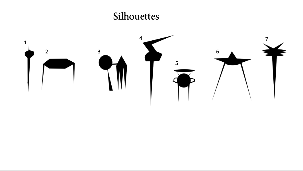
These were my previous silhouettes as I didn't know what the buildings would be however I have been told they are possibly too pointy in regards to the idea of it being fun and not scary.


These are some monorail designs I did aswell before the compositions


It has been said that these pictures are too extreme in terms of the red..it kind of loses the balance and its also harder to get a sense of space and it can be seen as too evil. This means the I need to work on a composition and all of the designs etc..to be honest I'm pretty lost with it. a curve balancing a point and a red balance a yellow and a blue balance and simple shapes yet still understanding and I don't think I can do it.
.Thursday, 9 November 2017
What If Metropolis?: working on assets and designs for final comp.

Street Lamp Designs

So as you can see I'm trying to figure out what it is I need in this final thumbnail I will be developing onto my final painting for example I am going to now design the monorail and the hero prop and the silouettes and the patterns/textures to go in them and develop the style to match the previous two i will also develop the style of the other tower etc... and keep posting my progress and also put all the paintings and designs onto a powerpoint so all the production art is there. To go into orthographic and everything else.
What if Metropolis?:Thumbnails and thoughts.@Phil


So these are the two I felt I was starting to get what I wanted. After looking at Frank R Paul I feel as though this has really helped me and I've tried to get fully out of my comfort zone as this way different from last time. ( I have been recently doing thumbnails trying to figure out what angle and how id like the final painting to be but I'm thinking some re-adjustments to this drawing I had before could work well for example...The hero prop could be the tower of a similar design in the foreground because this gives the idea of a tall structure and it has the right balance between lightweight and the mixture of shapes. I feel like the floor has a similar orbit feel as the path swoops around and this gives it the flow I need. however the image was too crowded and unnecessary so I have stripped the buildings that didn't match and kept the ones id like these two tall towers oppose each other diagonally in balance whilst you have a very sharp distance part cutting through the image this keeps the excitement and the idea of the levels and the structure that is rounded afar has a sense of eye direction to it I also feel like the closest object the tower should be most detailed as it is closer. and further away I planned on first doing patterns and silhouettes then combining them. Inspired from the sources I have been looking at and what materials they have e.g. the bullring in Birmingham. then merging these I can get a sense of the further away patterns I was describing. this would give me some assets and the idea of their being more. then I can make the orthographic of the props e.g. street lights on the side of the road and so on. this means I can have everything done after this painting. As for product designs I think lights and fan type shapes would be good especially for example the street light designs. and any patterns or designs from the exterior and interior I currently have could help. I could also do different monorail shapes. Colour wise. I was going to try and match the other two pieces of work as I feel it already has a sense of those two if tweaked and expanded on in a PS document.

( Although I was thinking a whole new perspective would be good rather than this I feel like this can work. And I can see how I can change it. Make it final as such.

Doing this thumbnail made me think about symmetry having a balance about it. and the street lights I was going off topic with the structures though. But I feel like its too off topic and boring. Its not orbital.

This perspective was interesting as I think this could have worked really well but I can't really figure out how this would work..I feel like its easy to make it more of a landmark picture than a city this way and I fell like focusing on the perspective will make me less think about the bigger picture id be trying to convey of the city.

In this thumbnail I think the idea of a suspended object a bridge a tower and a swerve in the road was way to bland and me worrying too technically about support.

I feel like this thumbnail is not good in terms of a sense of space and off topic too alien.

I feel like in these thumbnails the rocket type buildings and symmetry are interesting and match that sense of retro futurism but is very typical and ends up just being a rocket. So this could be something I incorporate somehow but I don't want it to literally be this.

This last thumbnail is to do with fans and shapes I feel like this could help with product design though.

These were some quick drawings regarding the bullring in Birmingham I think it gets the sense of orbit and the patterns on it circular metal plates can give me ideas for patterns and design but I wasn't trying to put my buildings in. I was just trying to think about the angles I could use etc. But I feel like these close off the picture and I think mine should be more free and balanced less obviously.


( Any Advice or Opinions Fell free to let me know)
Subscribe to:
Posts (Atom)


