Today we learnt about habitats and what the animals/monsters need to be a predator, scavenger or prey and the kind of shapes etc..
Wednesday, 31 January 2018
Monday, 29 January 2018
Sunday, 28 January 2018
Psycho Film Review
The Shower Scene


Fig1
This famous scene of Hitchcock's psycho works so well, its montage of cuts, its metamorphosis with the plug and the eye, the close up of the mouth, the sway from side to side each time there is a slash of the knife and the minimal gore to what we are used to seeing. Also how the eye line in which she is dead is still looking towards the money. The linguistic of the knife itself goes well to create tension. Which was made up of 78/52. The Black and White allowed for some rather odd but believable uses when it came to things like blood in the scene for example "Hershey's chocolate syrup for the blood which swirled down the plughole, because it looked just right in black and white. He blocked the shower head's central holes so that the camera could point straight up at it without getting drenched." ( Economist.com,2018 )

Fig 2
The storyboard which shows very well the code of enigma of the killer by how anonymous the shadow is who we believe to be the mother. The choice of marks adds to the struggle and quickness and goes artistically with the slasher genre. This storyboard was drawn out by Saul Bass.
"To witness the sequence broken down in forensic detail is to appreciate its economy of storytelling anew, and to see its influence on subsequent popular culture." ( Hans,2018 ) You could argue that the reasons for its influence was from its shattering of 1950's conformity or because it was one of the earliest of graphic violence or at least the illusion of this...as the knife doesn't actually touch the flesh except for two split seconds and the cuts help show this in in the newly born slasher genre or you could argue that it made previous horror films obsolete for example the old British classics as this avant grade film maker has a commentary on how the modern world could be a place in which passions and these emotions are being ignored or in this case flushed down the drain.

Fig3
This seen is not quite an Auteur directive motive as there was lots of involvements in this scene.
For example Robert Blochs novel which was the basis and then theres Joseph Stephanos detailed screenplay, The storyboards by Saul Bass although there is camera angles that wasn't included and Bernard Hermanns Violin and of course the actors of Marli Renfro and Jamie Lee Curtis.
It was the detail and collaboration that made this such a successful scene. "One of "78/52's most fascinating digressions is speculation about why, aside from personal psychology, Hitchcock indulged in what one observer calls"an act of aggression against fans, critics, actors." (Turan,2018)
Bibliography
Hans, S. (2018). 78/52 review – misfiring documentary on Hitchcock’s Psycho. [online] the Guardian. Available at: https://www.theguardian.com/film/2017/nov/05/78-52-misfiring-documentary-hitchcock-psycho-shower-scene [Accessed 28 Jan. 2018].
Economist.com. (2018). Cite a Website - Cite This For Me. [online] Available at: https://www.economist.com/blogs/prospero/2017/11/78-52 [Accessed 28 Jan. 2018].
Turan, K. (2018). '78/52' brilliantly, obsessively breaks down shower scene in 'Psycho'. [online] latimes.com. Available at: http://www.latimes.com/entertainment/movies/la-et-mn-78-52-hitchcock-review-20171019-story.html [Accessed 28 Jan. 2018].
Figure List
Divyasharma06.files.wordpress.com. (2018). Cite a Website - Cite This For Me. [online] Available at: https://divyasharma06.files.wordpress.com/2014/09/psycho_shower_scene_frames.jpg [Accessed 28 Jan. 2018].
Anon, (2018). [image] Available at: https://i1.wp.com/vashivisuals.com/wp-content/uploads/2014/02/WhoPsycho.jpg [Accessed 28 Jan. 2018].
Anon, (2018). [image] Available at: https://www.cctvcambridge.org/sites/default/files/styles/800x450/public/imagefield/editing%20concepts.jpg?itok=i4RxSWz5 [Accessed 28 Jan. 2018].
Saturday, 27 January 2018
Film Review: Edward Scissor Hands
The Set Design in Edward Scissorhands


Figure List
Anon, (2018). [image] Available at: http://www.revmodern.com/wp-content/uploads/2014/10/Edward-Scissorhands-Mansion-Stairs.png [Accessed 27 Jan. 2018].
Anon, (2018). [image] Available at: http://i.vimeocdn.com/video/263649121_1280x720.jpg [Accessed 27 Jan. 2018].
Anon, (2018). [image] Available at: https://static.boredpanda.com/blog/wp-content/uploads/2015/08/movie-locations-then-now-edward-scissorhands-suburb-pictures-voodrew-1.jpg [Accessed 27 Jan. 2018].
Bibliography
Lee, M. (2018). Edward Scissorhands, review: 'a true fairytale'. [online] Telegraph.co.uk. Available at: http://www.telegraph.co.uk/culture/film/filmreviews/11298442/Edward-Scissorhands-review-a-true-fairytale.html [Accessed 27 Jan. 2018].
Theguardian.com. (2018). Edward Scissorhands | Reviews | guardian.co.uk Film. [online] Available at: https://www.theguardian.com/film/News_Story/Critic_Review/Guardian_review/0,,558617,00.html [Accessed 27 Jan. 2018].
Honeybone, N. (2018). Film Review: Edward Scissorhands (1990) - HNN | Horrornews.net 2018 - Official Horror News Site. [online] HNN | Horrornews.net 2018 - Official Horror News Site. Available at: http://horrornews.net/103055/film-review-edward-scissorhands-1990/ [Accessed 28 Jan. 2018

Fig 1
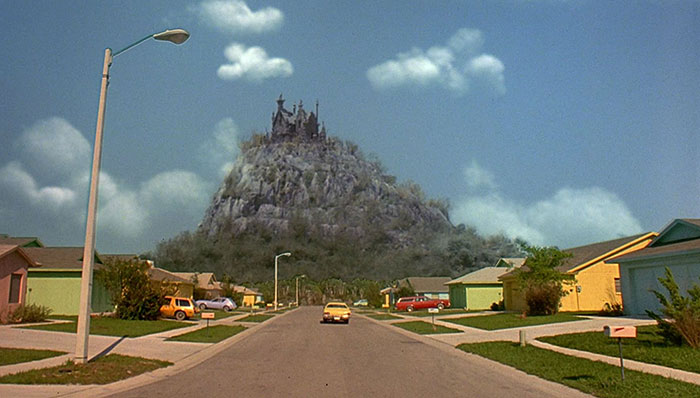
Edward Scissor hands setting is in a 1950's suburban setting called the Pasco County. That is very colourful in comparison to its polar opposite which is dark and Avante Garde castle that you could argue is like Burtons avatar. This could be a signifier for his alienation or difference working with Disney/ Beauty and the Beast. This specific set design really helps at telling the story just from the set. for example "Burton's modern fairytale has an almost palpably personal feel:it is told gently, subtly and with an infinite sympathy for an outsider."(Lee,2018) This makes the set really vital for narrative purpose and understanding the main protagonist.
Fig2
The set design starts changing slightly when Edward becomes more 'accepted' and seen as special and this adds a contrasting sense of belonging to what we first see from the original appearance of the setting."Clipping Hedges, is to fashion hairdos that the women mark them self out as something special. (theguardian.com,2018) The setting is very superficial and cosmetic and Edward brings out unorthodoxy as he is not a stereotype.
Fig 3
Its scenes like this you can see how important the set design was in this film, here you can see how it could resemble a beauty and the beast vibe and how after Edward becomes a threat he retreats back to his home and is seen sort of monstrous and very alone.
"(Winona Ryder) is like a living angel to the mesmerised Edward,his ongoing inspiration not only during the course of their initial encounter, but also after many decades of separation." (Honeybone,2018)
So in the conclusion the set design and interior was very vital because it emphasis his decision to stay alone in his fathers castle and his relationship with this women who he can't be with.
Anon, (2018). [image] Available at: http://www.revmodern.com/wp-content/uploads/2014/10/Edward-Scissorhands-Mansion-Stairs.png [Accessed 27 Jan. 2018].
Anon, (2018). [image] Available at: http://i.vimeocdn.com/video/263649121_1280x720.jpg [Accessed 27 Jan. 2018].
Anon, (2018). [image] Available at: https://static.boredpanda.com/blog/wp-content/uploads/2015/08/movie-locations-then-now-edward-scissorhands-suburb-pictures-voodrew-1.jpg [Accessed 27 Jan. 2018].
Bibliography
Lee, M. (2018). Edward Scissorhands, review: 'a true fairytale'. [online] Telegraph.co.uk. Available at: http://www.telegraph.co.uk/culture/film/filmreviews/11298442/Edward-Scissorhands-review-a-true-fairytale.html [Accessed 27 Jan. 2018].
Theguardian.com. (2018). Edward Scissorhands | Reviews | guardian.co.uk Film. [online] Available at: https://www.theguardian.com/film/News_Story/Critic_Review/Guardian_review/0,,558617,00.html [Accessed 27 Jan. 2018].
Honeybone, N. (2018). Film Review: Edward Scissorhands (1990) - HNN | Horrornews.net 2018 - Official Horror News Site. [online] HNN | Horrornews.net 2018 - Official Horror News Site. Available at: http://horrornews.net/103055/film-review-edward-scissorhands-1990/ [Accessed 28 Jan. 2018
Rope Film Review
(Fig.1)
Alfred Hitchcock's camera shots can make the film seem like one big take so he made their no visible cuts. It was choreographed with 10 minute takes and so was the screenplay so that the main focus is where the drama needed it. Because Hitchcock was basing the film on a play called the Leopard-Loeb Murder. He had to think about the space he was using even more and although he used such a space we never really questioned what was happening."the killing taking place inside obscured by drawn curtains shows not just the directors awareness of the small space separating life and death, but also how much of it he is allowed to show." (Croce et al.,2018 ) The camera positioning and usage plays a huge role on what we as an audience see and understand and the themes of brutality and sexuality. Which you could argue is another reason why he shows very little intimate scenes, he merely hints the context.
(Fig.2)
Here you can see the pull focus technique which is the switch between the domestic dinner party and the chest which holds the body inside. This is a classic thriller technique this can help Hitchcock's tension build until he is to release it when its more unexpected later. Also the use of the Foreground with the chest. He also used the things that were happening in this long take to change the film reel for example "These breaks he usually accomplishes by having the camera appear to pan across someone's back, during which dark close-ups the film reel is changed." (NYtimes.com,2018)

Bibliography:
(Fig 3)
The theme of theatricality comes into play and even though Hitchcock went against his montage/cut editing in this film he managed to keep people on edge when the maid is ever so slowly taking book by book off the chest.
"Prop men constantly had to move the furniture and other props out of the way of the large camera, and then ensure they were replaced in the correct location. A team of sound men and camera operators kept the camera and microphones in constant motion." ( Horror Cult Films,2018 )
Croce, F., Henderson, E., Bowen, C., Bowen, C., Camp, A., Seitz, M. and Henderson, E. (2018). Rope | Film Review | Slant Magazine. [online] Slant Magazine. Available at: https://www.slantmagazine.com/film/review/rope
Horror Cult Films. (2018). HITCHCOCK MASTER OF SUSPENSE #34: ROPE [1948] | Horror Cult Films. [online] Available at: http://horrorcultfilms.co.uk/2014/05/hitchcock-master-or-suspense-34-rope-1948/ [Accessed 27 Jan. 2018].
Nytimes.com. (2018). 'Rope': A Stunt to Behold. [online] Available at: http://www.nytimes.com/library/film/060384hitch-rope-reflection.html [Accessed 27 Jan. 2018].
Figure List
[Accessed 26 Jan. 2018].
Anon, (2018). [image] Available at: http://prettycleverfilms.com/files/2013/09/HItchcockRope-300x225.jpg [Accessed 26 Jan. 2018].
Anon, (2018). [image] Available at: https://incessantpadding.files.wordpress.com/2011/03/rope2.jpg [Accessed 26 Jan. 2018].
Lisathatcher.files.wordpress.com. (2018). Cite a Website - Cite This For Me. [online] Available at: https://lisathatcher.files.wordpress.com/2012/09/rope-tense-chest-scene.jpg [Accessed 26 Jan. 2018].
Thursday, 25 January 2018
Wednesday, 24 January 2018
Soundscapes with Kat
Things we were looking at:
- Modulation depth
- Modulation Rate
- Waveforms
- Noise, Brown, Pink,White
- Doppler effect
- Distortion
- Convolution Reverb
- Delays and Echoes
We also removed disturbances by using heal Brush tools and background noises and created our own sounds.
We also learnt about a Canadian comedian Norman Mclaren the first to generate sound by painting on literal film. see Pen point percussion video, neighbours, synchromy. The actions and emotions effect the music aswell. And can be an influence to people that use sound by making it.
Character Design Lesson
We had to pick a iconic character and have a new design or object the coud use by taking shapes and knowledge of the character for these designs of jetpack I looked at the Space Ranger symbol on his arm and saw the rocket and also the scene in toysjory with it made me think it could be pretty cool like faster also the wings are based on his insignia on his chest which is similar to the space ranger one but has wings on each side so I decided to put these together and add the buttons and the part which replicates his middle half. I also though it could match woody well as its quite heroic or like a bird and that eagle type icon could match n that sense as a companion also since buzz is seen diving then his wings come out I thought this action could be emphasised more with the wing movement below.
Today we looked at characters that were merged with an object and how the type of people obsessed with that thing could be replicated. I picked a rock metal guitar and a rocker billy which would have quite a calm layer back gesture. Whilst the rock one is erratic the necks can give more of a linguistic and performance so I will be doing some drawings of these with a marker pen with the swerves as I can be quite stiff with how I draw so I will be taking this advice from Justin.
( I will updating character lesson posts if I am doing more development. )
The Guitars ( flexible rocking out on stage)
Tuesday, 23 January 2018
Nats Lip syncing lesson
I looked at one of the animation books on lip syncing and tried to start constructing the mouth with it.
Monday, 22 January 2018
Maya Today
Today we learnt about how you use mass and Gravity and bounciness and magnitude to get the weight and everything to look right. We changed the animation to FX ( effects ) Also how the chains had a lower res model inside but not the outside. and used 25fps so it counted each frame. Passive body holds the object in place when gravity is switched on and the chains active rigid body this is in the fields and solvers.
Motion paths are for any object that needs to follow a path you connect the path with the circle under the object with the path by selecting them then you use the channel box to exaggerate each part as it moves around e.g. moving to the side.
Thursday, 18 January 2018
Character Design lesson
In my lesson with Justin Wyatt I got given knights, I chose the idea of making the knight physically impaired to the rest the reason for this is to have a unstereotypicaj protagonist and a motivational character because he struggles. e.g sword to big for him and pathetic sized helmet the glasses and the attire show his vulnerability and recognisable of a nerd at school. (role-play.) and the normal life to fictional aspect.
The second character is juxtaposed the protagonist because this makes a more interesting character because Justin said about silhouettes and if they communicate the characters attributes well. so this is a more stereotypical knight but his face is non threatening without the helmet. and looks like jock. maybe without the amor he is fat or just face seems misplaced for comedy value.
Silhouettes of possible middle character.. girl could be taller and the protagonist. I am going to develop some of these designs for future. :] We also learnt how different shapes add different meanings or characteristics.
Swinging sword: loses control needs to be adjusted so its less stiff and more exaggerative of patheticness.
Storyboard box of how the character sees the bigger knight ( Scary ) dominance over box etc.
like for like storyboard
For my like for like storyboard I looked at The Lord of the rings Fellowship of the ring. Tried to think about the frames outline and how that could reflect the mood or whats happening in the scenes for example first frame is sweaty, nervous scared camera goes down so the frame sicks the down motion and sweat. The second frame is nervous so a shaky camera would get that emotion. arrows show the direction. the direction of the swords pointing at the target and one hand/sword in the foreground. The last frame has a slight confusion to it so the slight movement of looking down does this as Frodo disappeared. There is also pre-viz material that was interesting.
some pre-viz picture examples ( couldn't find for this scene unfortunately.)
Monday, 15 January 2018
Thursday, 11 January 2018
Some Quick ideas From Script to Screen
Subscribe to:
Comments (Atom)


