Thursday, 31 January 2019

Storyboarding opening credits Ideas.

(Rough Ideas)

This was the first ideas I had in mind but they are all very central etc.
The second idea made me use white background as I was worried about the black lion? Also I started to get ideas like the helmet being used to do light trails and credits.
By enlarging the head and only showing half of the helmet it became more abstracted and interesting and more easy to follow the trails.
Then came the third idea and focus which I will be working on.
So first 
1.) Helmet half. 
2.) Each trail goes off to the right represented each individual squad member of Voltron.
3.) And then the trails go off in directions to form the correct formation which I think is going to be the leader in the front rest slightly behind in a formation like a V. 
4.)Then they are going to split in all different directions like arrows. Like flying lions.
5.)We see each trail by each one in order from left to right giving a different dynamic view with credits in either the gaps or on the trail but likely gaps now. 
6.)Then they are going to all meet to form up the words Voltron or one is and the rest after? 


I might still have the opening as background black more dynamic lines like this etc. 
and do shirts colour a grey colour? as his lion is black and grey and would work. 


Thursday, 24 January 2019

Graphic Design Poster and Assets for opening (Voltron)

(Plan)
These are the individual weapons and each colour each member of Voltron has. This was going to be a part of the animation where the trails form into the idea of the light trails for the lion. 
I need to find a way that all of the team comes together to form Voltron/ a team. but this is what I have so far. ( Saul Bass inspired. ) 


Some ideas for Premise

Low-Poly character of myself?
Low Poly character of Iron Warrior.
(Two design ideas, Heresy armour or Space Marine version.)
Props like tissues, Both characters interact with each other need facial expression?, Poses? Bolter prop, Dice? Anything relevant to how Warhammer 40k has helped me. 
Rigged. Less focus on background.
Cool textures. 
Simplistic.
As miniature's based on my own.
( time to keep this and forget about it until I can develop more from questions or do whole new drawn ideas entirely? )


Thursday, 17 January 2019

Premise Ideas (4)

1.How Warhammer has helped me.

  • Channeling my unwanted emotions. and very high or non existent emotions from my experiences through my Aspergers.
  • Escapism from the dull reality by going into a Science Fiction Universe.
  • Allows me to feel otherwise in control when i don't in other situations.
  • Something i am good at, Strategy which helps me think in a different way and get a confidence boost.
  • Becoming part of a community of fans and being able to relate to them when i have narrow interests.
  • Different factions,armies,palette so that it is more personal.
  • Competitive nature, makes me want to try harder.
  • Inspires me to make something that is also using Modelling software/Animation.
  • Allows me to get obsessed over something of interest and keep me occupied.
  • Allows me to unwind from any failure or struggles ive had with learning or understanding other people.
  • Two Characters, Me and a Space Marine and funny interactions between them, voice over focused on them and not the environment that is blank. for example helps deal with emotions passes tissues to me. Stylized by me and simplified graphics and models.

2. My Room is very personal.

  • Animated Environment?
  • How other people see my room compared to how i see my room.
  • Parent vs me, parent=unorganized,weird me=organised,fun
  • Props, items i care about and who they're from=items from family and relationships.
  • How long i spend in there
  • Staying up late.
  • Talking online
  • My consoles

3. Asperger's Syndrome my experience.

  • Aggression
  • Not understanding the way people are acting and becoming slightly uncomfortable
  • Not being able to relate
  • Narrow interests and obsessions
  • Over thinking
  • Struggling with Learning
  • Hyper emotions or struggle to feel any emotions 

4.Louie the Chihuahua. aka (LouLouMeerkatBear)

  • Why i aspire to get a Chihuahua now.
  • Describing the cute and funny natures of Louie. Including acting like a Meercat, Getting jealous when i use my attention on a different dog and how he is now nicknamed my boyfriend as a joke and his weird tongue thing he does and how he comforts me.
  • Louie has taking a liking to me before he was awkward with people, now he scratches at the door for me and spins in a circle for me and follows me around..i like going to my boyfriends as Louie feels like he is indirectly mine as he acts different with me and i was the outsider. 
  • Also helps calm me down being with Louie.

Film Review: Mary and Max (2009)


Mary and max poster.jpg

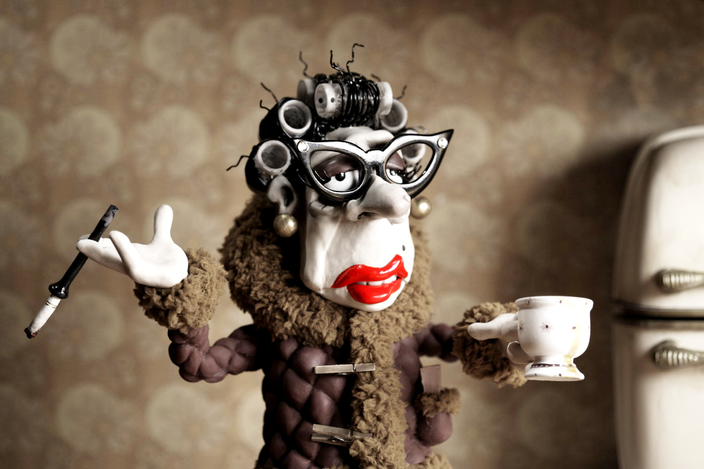
The Core Premise: There is more than one theme in this film including issues such as child neglect,friendships,alcoholism, forms of addiction and recovery and the obscurity of life which means the unimportant or state of unknown around it. Bullying is another theme shown and loneliness and even mental illnesses and the possible backlashes from the illnesses for example Max is Autistic, specifically diagnosed with Asperger Syndrome and his problems from his complications with how he understands other people leads him into anxiety and isolation. There is also other problematic repercussions from some of these negative themes like obesity,suicide,depression, isolating ones self and anxiety around social situations and also past traumatic memories.


Image result for mary and max making of typewriter underwood
Image result for mary and max alcoholism
Image result for mary and max mary

The Animation: Animation was used instead of live footage because it is easier to exploit the medium and explain emotions,problems and difficult experiences through storytelling and keep it interesting and not too upsetting or uncomfortable this also allows the style and exaggeration to fortify these difficulties and also express them.

Image result for mary and max the making of

Production: The Animation was made with clay and is a stop motion which was made using 133 sets and 212 puppets and also 475 miniature props and there was a Underwood typewriter so it could be fully functional this took nine weeks to build and also design.


Reception: The humor is more aimed at and understood by Australian's and the offers Elliot received were from computer animators and he exclaimed that he does not have the interest or knowledge for that and that his work is quite odd and just wants people to watch it, however the film was received rather well outside of his area. And he has visited Pixar and Dream works and says he thinks it is an advantage to not fit in. And he has done well internationally people thought it was funny and had important themes.

Image result for mary and max adam elliot

Authors: This animation is based on a true story as writer and director Elliot claimed that the character Max was inspired by a pen pal he had been talking to for twenty years who also lived in the same location of New York. This is Adam Elliot. Where Mary grows up is also based on where Elliot grew up as he grew up in a place with the same place e.g. Mount Waverly.
Wednesday, 16 January 2019

Lighting and Rendering Ambient Occlusion


Lighting and Rendering Mesh Lights

I learnt how using mesh lights in close proximity can add more noise so sampling and render settings are important. Allowing visible light allows the physical object to be seen. The mesh light has the hyper shade node projections middle mouse dragged over the colour sections and labelling both the objects and the projections accordingly made it easier to find the projections you go into textures and select them all and drag them all into the workspace box and you can show all the link by pressing the button above which shows the connections. Also having lots of mesh lights can make the scene the longer to render. The exposure is turned up also.

Friday, 11 January 2019

Mud box Apple


First we made a polygon sphere and then UV'd it by using cut and unfold. 
Cut down the middle edge selected and also the top and bottom parts. After this we took it into Mud box and started using levels and layers. the layers can be upped by pressing shift d. or to decrease it is the page down key. then i used some painting to see what it looked like and used the sculpt then smooth for texture and cut and smooth and push in etc to form shape.
If applying one color to the object flood it so it fills more than just what you see.
Also if you use bump map and have the light on it you can get extra details and using specular and alpha.

For_Infinity_Rendered_Edited